Tuesday, October 23, 2012

Bad Design is Everywhere, Even Cookbooks

You know, I hear they was really tiny guys.

~  Napoleon Bonapart (Ian Holm)
Time Bandits
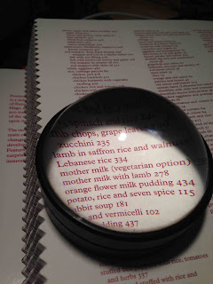
Lebanese rice; once you find it, it's not there
This morning, I had to break out an old dome magnifier to read the tiny font on Salma Hage's The Lebanese Kitchen (Phaidon, 2012). Partly this is my middle-aged eyes needing a boost to read, but partly it's just ridiculously tiny font. How tiny? That "a" in "Lebanese rice" on the photo of the book's index is 1 millimeter high — about a 3-point font for you designers. To put it in perspective, that's smaller than a single, tiny coriander seed. Maybe the small font is a diversion from lax indexing (Lebanese rice is actually on page 332, not 334 as indicated).

Lilliputian font wouldn't be an issue on a tablet like the iPad or its competitors. Reading on a tablet can be a great experience for so many reasons. A mundane point I particularly like is the ability to change font size as desired; quite literally, font size there is as arbitrary as it is irrelevant. Too small? Make it big. Too big? Make it small. Don't like that font? Change it to another style entirely. But books — printed books — are ancient technology; one cannot double-tap the page to bring up a definition or shrink the image by squeezing together thumb and forefinger. Once it's printed, it's printed and there's no changing it. One does not simply make the font bigger or re-flow the copy on a printed page; it's locked.

Kona Stout Ice Cream ingredients
Jeni Britton Bauer's editing and design team, you're all culpable here, too. The content of Jeni's Splendid Ice Creams at Home (Artisan 2011) is fine, but its design is among the worst of otherwise serious contemporary cookbooks in my collection. The light hues of blue, green, tangerine, purple, and pink of the ingredient lists bleed into light backgrounds. Cute? Arguably. It's clean and light, almost hygienically precise — weighty subliminal elements when dealing with dairy. More to the point, those ingredient lists are all but illegible compared to larger, darker words on the same page. The subtext here is that ice cream doesn't matter; stories about ice cream do. Before I thought to use the dome magnifier on this one as well, I had to take a picture of a recipe with my smart phone, access the photo on my iPad's photo stream, use a photo editing app to sharpen the photo, increase the contrast, and enlarge it right up to the point where the letters started to pixilate — then back off a hair — simply so I could read each one. Understand: I've never had to do with with another book and I really like ice cream.

A plea, then, for book designers and publishers; if something is worth putting in the book, it's worth doing it right. Not everyone has fancy glass magnifying domes or the gimlet eyes of a 23-year old designer. Don't give the mechanics such short shrift; make indicies, instructions, and ingredients lists as legible as head notes, introductions, and forewords.

Goes well with:

  • Know who has a great index? C. Anne Wilson in her distilling history, Water of Life.
  • The dome magnifier above came with my copy of The Compact Oxford English Dictionary. Decent models can be found online for under $50. Here's a sampling
  • Speaking of short shrift and completely off-topic: one of the best lines about ugly kids remains "I was so ugly as a child that my parents put me in dark corner and fed me with a slingshot." 


No comments:

Post a Comment