Oh, I'll spend hours after I should have gone to bed, staying up staring at the glowing screen until tears of fatigue flow freely down my cheeks. I grew up in a house with not only a butter churn, but also printers' drawers; early exposure to block lettering instilled an abiding interest in minding p's and q's. More than once, as I've trawled through the offerings of online font vendors, trying out phrases, and learning how various designers have used this or that font, dawn has taken me by surprise.
Ramiro Espinoza has combined all three elements — booze, Amsterdam, and fonts — in one tale. Espinoza lives in Amsterdam where he runs the digital font foundry, Re-Type. Intrigued by the cursive, curly script he found on the city's "brown cafes" (i.e., neighborhood pubs) and concerned that they were disappearing as old facades succumbed to renovations and new owners, he set about tracking down why the pubs in particular used this distinctive hand-painted font.
In a way, my research into the ‘Amsterdamse Krulletter’ (Amsterdam’s Curly Letter) began eight years ago as I was walking down the streets of what is possibly the city’s most beautiful district, the Jordaan. As every local knows, this area hosts quite a few of the old, traditional pubs that the locals call ‘bruin cafés’ (brown cafés). In urban environments, type designers are always looking at letters, and especially at hand-painted ones. It didn’t take me very long to notice that many of the pubs in the area had their windows painted in a very interesting and beautifully executed script. Later I discovered they had been painted throughout other parts of Amsterdam too, notably also in the De Pijp area.Espinoza tracks some of the examples to Leo Beukeboom who began painting for Heineken Brewery in 1967 and who hand-lettered signs for pubs sponsored by Heineken. "But," he writes, "the history of the style goes back further than that." Espinoza lays out his detective work on this beery lettering with additional connections to Amstel Brewery and 17th century Dutch calligraphy.
 Read his ILoveTypography.com article and check out additional photos here.
Edit:
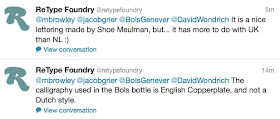
Feh. Mistakes when I'm alone are bad enough, but making them here in this public forum is deeply embarrassing. The why of it doesn't matter, but I posted copy without checking facts. Sorry about that. Good news, though: we've heard from ReType Foundry more about the Bols script. Seems we should be looking toward England rather than the Netherlands for this one:
A note on pronunciation: Americans tend to pronounce this malt-wine spirit "GEN-uh-ver" but every Dutchmen I know calls it "ye-NAY-ver." On his show The Layover, Anthony Bourdain either plays it safe or forgets; he uses both.
I'm going with the cloggies on this one. Grab yourself a bottle or two. Good stuff to hand on hand.


I would not say this is a major mistake since during the Bols Genever launch event in Boston, they spoke at length about how the label reflects the Dutch style of painting store names and the like. They went so far as to show photos of different examples of this writing. Well, they convinced me at least that it was that style. But alas, I am not a fontgeek.
ReplyDelete